
Modern Pastels
Using Pastel Wall Colors and Accents in a Modern Way
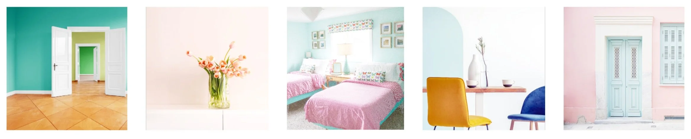
Pastel colors have, in the past, been seen as alternately juvenile or elderly — at once only at home in a child’s or grandmother’s home. But times have changed, and those beautiful sherbety colors are bringing spring and joy into homes in a bright, new way. I look for pastel colors to bring a pop of light and cheer — especially as winter begins to turn to spring, and I am longing for a fresh start.
While our current home is dressed in deeper tones, our last house, the 1948 Subdivision Sweetheart, featured several pastel hues. Click on the image for the paint colors and sources.
In search of pastel inspiration I turned to my favorite designers and DIY accounts on Instagram, and they did NOT disappoint! Here are some of my favorite ways to use pastels — splashed on wall colors, wallpaper, and so much more!
Pastel Front Doors
I recently installed new front doors on our house, and I poured over hundreds of paint colors in search of just the right shade for this house. Pastels have a rich history in Mid Century Modern architecture — just think Palm Springs and all the beachy pastel pops of color on those homes! One of the most unexpected places to use a pastel color: the front door. And I think it makes such a statement! I love a pastel door with almost any style of house — especially set against a crisp white.
Perfect Peach
@Kellygolightly takes a driveby look at a perfectly peachy door in Palm Springs with that Mid Mod vibe.
Positively Pink
The 134 Prince Hotel in Annapolis sports a bright pink door on it’s Dutch Colonial Revival facade. Just because you have a historic building doesn’t mean you have to be stuffy!
Lovely Lime
@plaids.and.poppies welcomes her guests with a lime green door that’s saturated with sunshine.
Pastel Accent Walls
If you’re not ready to commit to a fully pastel room, an accent wall is a great way to bring pastels in for a punch of color without surrendering the entire room. I love a good accent wall, personally, and they can be a great, eco-friendly way to make a big change. If the rest of your room is in good shape, just paint one wall which saves paint and money while still creating drama.
Seaform Arch
@Living_with_Kay used this delicate seafoam green to delineate an arch in her dining room. It emphasizes the coffee bar area and adds architecture to the space without a lot of work.
Pretty in Pink
@SmashingDIY mixed this beautiful pink wall with neutrals and patterns for a fresh take on a home office. It’s a little 80’s flashback but with sophistication and elegance.
Unexpected Apricot
@RebeccaDIY is another color master. She balanced the richness of the wallpaper in her living room with this pop of apricot paint — an unexpected accent which brings life and fun to a brilliant room.
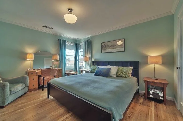
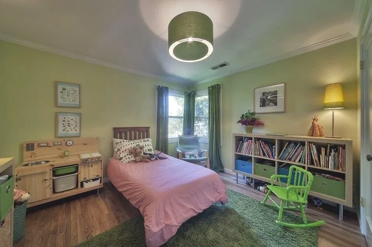
Pastel Bedrooms
Using pastel colors in a bedroom might bring to mind nurseries and toddler rooms, but there are beautiful, sophisticated ways to use pastels which make bedrooms relaxing and dreamy for anyone. It’s all about what you pair with it, frankly.
Retro Vibes
When I redid our guest room for the One Room Challenge, I chose a pale shade of teal for the walls. I wanted a color that would balance the bright red gingham duvet colors and pulled the color from a vintage map of Hawaii which served as the inspiration for the whole room.
Wise Sage
@susanhilldesigns does the same thing with a very different result in this gorgeous bedroom. Here a pale green balances somewhere between neutral and pastel — paired with a strong orange for an elegant, sophisticated result.
Patterned Pink
@SLCInteriors takes pink out of the child’s bedroom and into a classic, sophisticated context pairing this beautiful pink wallpaper with crisp white trim and modern-yet-classic furnishings
Pastel Kitchens
Pastel kitchens? Yes, please! When done with sophistication, a pastel kitchen can be absolutely gorgeous! Consider pastel tiles, cupboards, or even appliances!
Magical Mint
@athomewithashley took a retro approach to her recent kitchen makeover, and I’m here for it! I love these minty appliances as well as the retro mint sink, too!
Perfect Green
@JoyStreetDesign chose a green somewhere between lime and avocado landing in the sweet spot for these painted kitchen cabinets. The whole kitchen oozes charm with a souscon of spice.
Not-So-Baby Blue
@Rightmeetsleftinteriordesign used gorgeous glass tile in a pastel blue shade in this kitchen. While this color scheme is pefectly at home in a nursery, it sizzles in the kitchen.
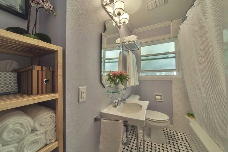
Pastel Bathrooms
One of my favorite places to use pastels is in the bathroom. Pastel colors are both flattering and restful. But pastel bathrooms can tip toward musty if you aren’t careful. These examples, however, aren’t dated or drab. Each one works a little pastel magic!
Nothing Fishy Here
@JoyStreetDesign uses one of my favorite pastel wallpaper patterns! Those fish in very traditional pastel shades bring a whole new pop to this powder room. Nautical without being tired, and seaside without being snoozy.
Perfect Pear
@rightmeetsleftinteriordesign gets it ALL right with this take on American Craftsman. Balancing a traditional wallpaper border with very modern cabinetry and sconces, this is a perfect pair in pear.
Blue & White Done Right
@Shaunaglenn ‘s take on a classic blue and white bathroom feels fresh and clean. Those ruffled mirrors and the striking floor lift the room into a new tradition while nodding to the house’s past.
Use Pastels As A Saturated Accent Color
If you take a traditional pastel and choose a shade that is more saturated, that color will pop. It’s a great trick to use both on a wall or when choosing accents in a more neutral room.
Pastel Rainbow
@Charlotteshouse lives in full color and uses pastels skillfully throughout. This DIY table project is a great example. She painted the legs a saturated pink pulling from her rainbow striped rug. The result is cheerful and charming!
Lively Lavender
@DesignAddictMom uses a saturated shade of lavender in her sophisticated living room. And both she and her fig tree look AMAZING as a result!
Luscious Lemon
@TheCollectiveDallas is one of my favorite accounts for pastel inspiration. Almost every room she creates uses pastels in amazing combinations. I love these citron stools against a neutral wall — just the right pop without a hint of sourness.
Use Pastels Balance Deeper Colors
And there are some people who skillfully use pastels as neutrals — balancing stronger colors in a scheme. It takes finesse to do well, but when it is done well: it is amazing!
Verdant & Vibrant
@LostOrchidInteriors mixes colors and patterns with such skill! She has an eye for florals and tends to use pastels, like this green print couch, to anchor her colorful designs. The effect is magical!
Chic Coral
@CJSwank_NewYork brings grandmillennial style to every room without fussiness or pretense. These beautiful coral velvet pillows add a lightness to a room dominated by wood and heavier elements.
Awesome Aqua
@Shaunaglenn is my all-time fave! She is a master of color and pattern, and if I could have anyone decorate my house, it would be Shauna. I love how she uses this aqua wall to off-set the brilliant orange of the bed in this room. I am pretty sure it is the same color I used in our guest room with a totally different effect!
Whether you are looking for an accent wall color or a pastel color for an entire room, I hope these masters of pastel decor have inspired you. Take a fresh look at pastels. When used with modern accents and fresh color combinations, they will bring light and air into any room.
